Fonts That Feel Right: Free Picks for Smoother Design
- fontfreedownloads
- Jul 7
- 2 min read
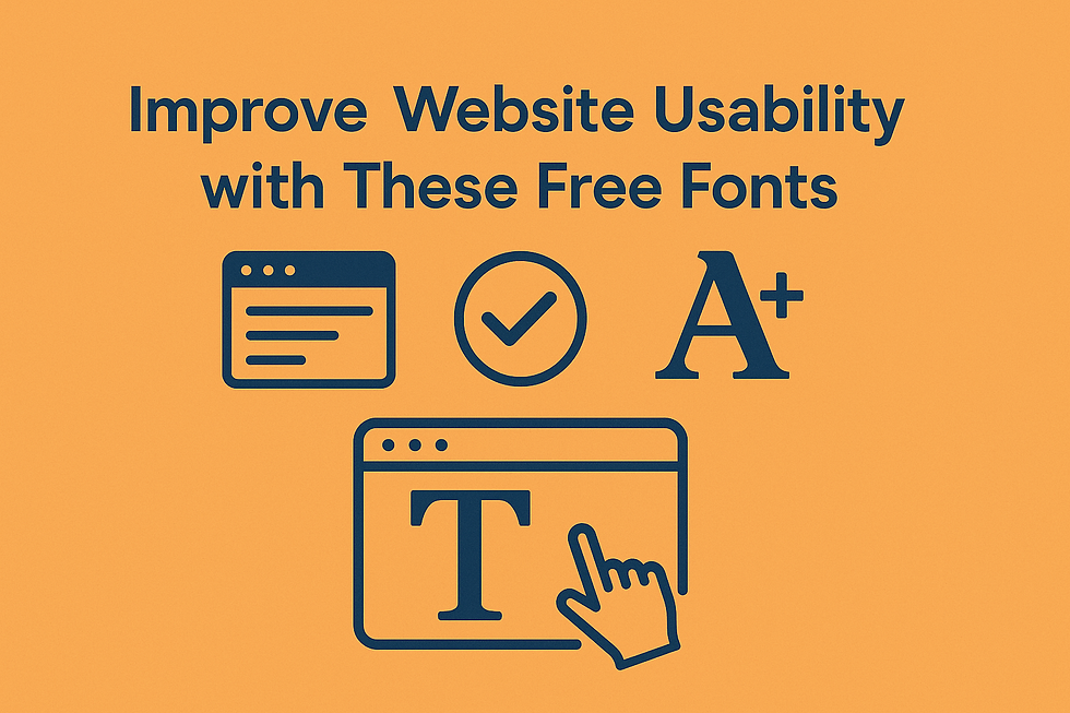
When creating seamless, user-friendly designs, the smallest details often have the biggest impact. One of those details is your font choice. Typography shapes how users perceive your content, how easily they navigate it, and how long they stay engaged. That’s why picking the “right-feeling” font is more than a creative decision; it’s a UX strategy.
The good news? You don’t need to pay for premium typefaces to create professional, smooth designs. Many free fonts available today combine aesthetic appeal with high usability. Whether you're designing for a website, app, or brand identity, the fonts below offer the perfect mix of clarity, tone, and polish.
Here are some of the best free fonts that just feel right for modern, clean design.
1. Inter
Crafted for digital screens, Inter offers excellent legibility and smooth spacing. It’s ideal for web and app interfaces where readability is key across various devices.
2. DM Sans
Simple, open, and easy on the eyes, DM Sans is designed for clarity and performance. It’s perfect for minimal layouts and mobile-first design systems.
3. Lato
With a friendly but professional tone, Lato bridges the gap between creativity and usability. It adapts beautifully to websites, presentations, and brand visuals.
4. Poppins
Geometric and clean, Poppins brings structure and style to headings and interface elements. It’s great for modern brands and balanced compositions.
5. Nunito
Rounded and approachable, Nunito softens your design without sacrificing professionalism. It’s especially useful in education, wellness, or community-based platforms.
6. Open Sans
Known for its neutral, highly readable structure, Open Sans is an all-purpose font that fits everything from blog posts to e-commerce product descriptions.
7. Work Sans
Designed for on-screen readability, Work Sans performs well in UX-heavy layouts. Its simplicity allows content to shine without distractions.
Why These Fonts “Feel Right”
Consistency: Smooth fonts maintain rhythm and harmony across all elements.
Readability: Clear letterforms help users stay focused and engaged.
Tone Matching: A well-chosen font sets the right emotional tone, from playful to professional.
User Comfort: The right font makes your design feel effortless; users don’t need to think, they just scroll and interact.
Where to Find These Fonts
All the fonts listed above are available on Google Fonts, a free and trusted platform for open-source typefaces. You can also browse trusted Font Free Downloads websites for additional styles suited to commercial and personal projects.
Final Thoughts
Good design isn't just about how things look; it's about how they feel. Your fonts can subtly guide, comfort, and connect with users. By choosing clean, smooth, and well-balanced typefaces, you improve both the visual experience and the emotional impact of your design.
So next time you're building something new, start with fonts that feel right, and your users will notice the difference.


Comentarios